Hello, mellow yellow
My first project of 2014 was refinishing this chest of drawers for a particularly dear client:

This piece was in her childhood bedroom in her late parents' home, and she has held on to it ever since. I was touched that she would trust me with such a cherished antique! However, it had dings and chips galore, and a knob was missing. (Replaced temporarily with a Lego to protect toddling grandchildren… now that's creative!)
My client wanted something bright in her family room. She gave me a pillow to coordinate with, and described her ideal yellow as "buttery, and NOT harvest gold or lemon."

So I went to Vintage Style and Designs in Louisville and started testing colors. I met with Brandy - she was immensely helpful and mixed a ton of color combos with me. I came home with English Yellow and Cream. These mixed to a perfect toasty butter color, and matched the pillow… at least in the store, they matched.
But then I painted my first coat. And the second. Oh God, they weren't matching at all - it was TOO much like a stick of butter, and looked like nursery furniture.

I texted Brandy in a panic - she convinced me that another coat with sliiightly different paint proportions would work - plus the dark wax. If it had been my own piece, it would be OK, but I was NOT about to mess up color for a client!

Can you believe the difference a coat of dark wax can make? I love it… my arm was sore for a day afterward, but I just love massaging that stuff into all the nooks and crannies of an old piece of furniture...

The biggest lesson learned from this project is that
Yellow is notoriously difficult!
I've heard this from interior designers before, but thought paint would be some kind of exception… just think about all the types of yellow out there, and how different people would call them different things…
...school bus yellow... mustard yellow (and then is it Grey Poupon yellow or French's yellow?)… butter... sunflower yellow... harvest gold… cream… lemon... no.2 pencil... saffron yellow... dandelion yellow…
...and they all look different when the light changes! Why couldn't I have suggested an easy color? :)
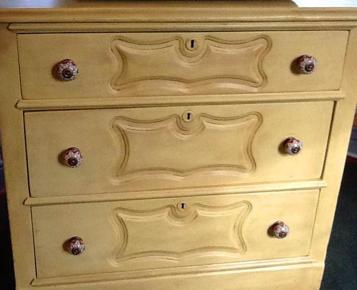
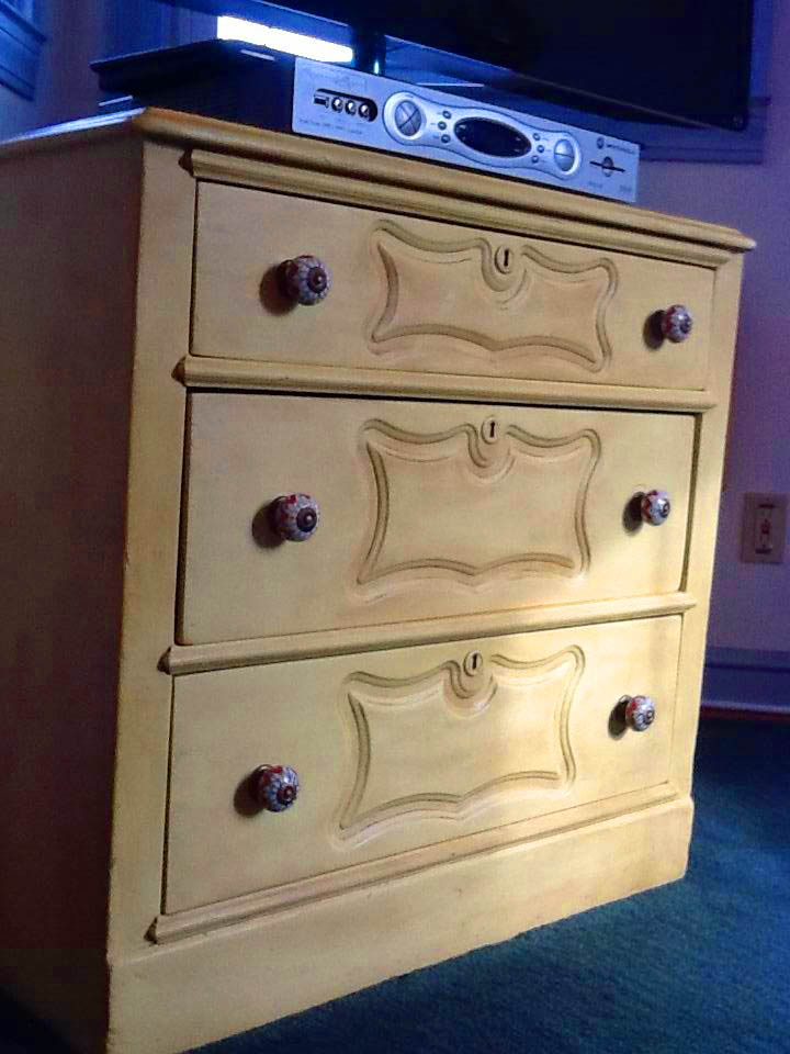
My client found some AWESOME knobs at Anthropologie that coordinate with the piece. I love how it's so happy and sunshine-y! The yellow was challenging to match but I'm SO glad I did it and know how to do it again. (Hint, hint. Let me paint your furniture.)
I look forward to enjoying this refurbished antique many, many times when I visit this lovely client in the future! Cheers to a sunny new year!